| Architect | Rafael Viñoly |
| Date Built |
Under
Construction |
| Location |
Fenchurch
Street |
| Description |
|
|
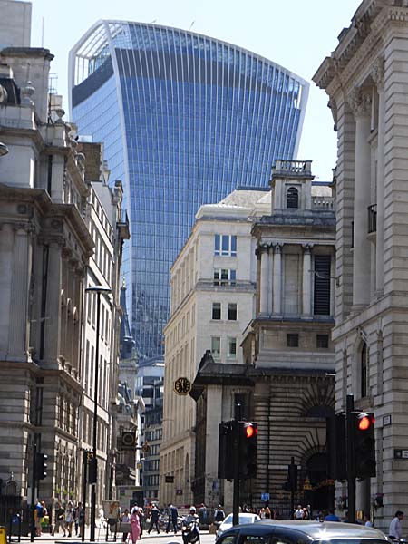
The Uruguayan
architect, Rafael Viñoly, is the designer
of 20 Fenchurch Street. His was the
successful entry in a competition held by
the British developer "Land Securities" in
2004.
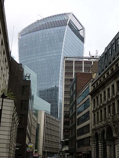 The brief was to create a, " ... high-performance, energy-efficient building to replace an obsolete office tower." (shown below) 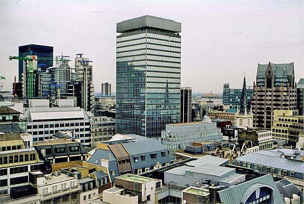 The architect's website
explains that the design, "
... breaks with the perceived
boundaries of common architectural
expression for clear reasons: the
floor plates widen at the top of the
building instead of the bottom, adding
incremental public space at ground
level, providing extra leasable floor
area on the valuable upper stories,
and generating a large public
Skygarden at the pinnacle of the
building.
"
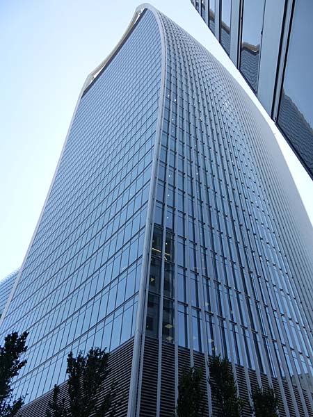 At street level the
building will have a so-called "pocket
park" that will provide, " ... a
public gathering place and pedestrian
paths through the site."
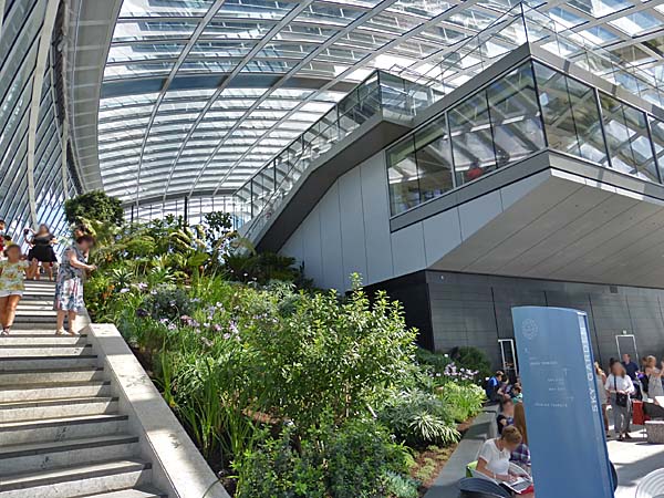
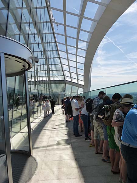
Public access will also be provided at the
top of the building. "The
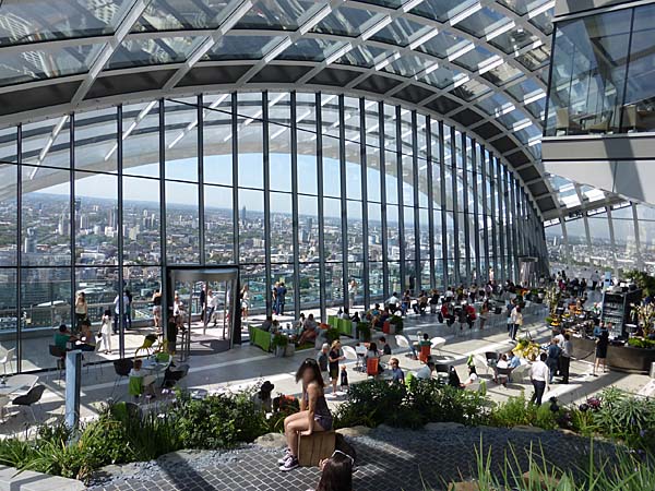
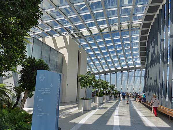
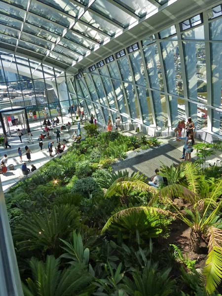
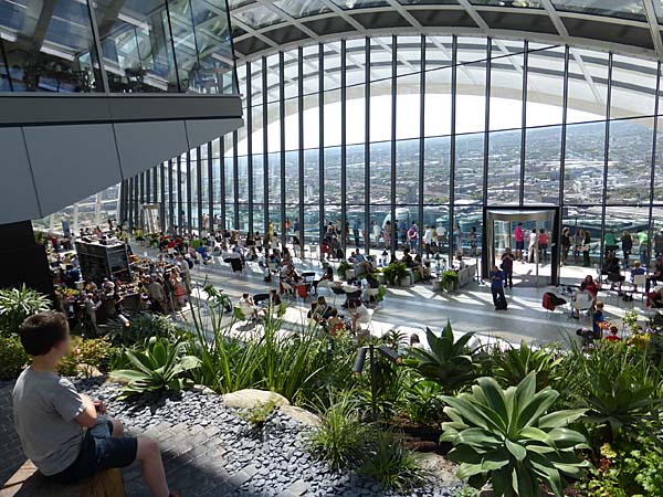
Skygarden tops the building with
London’s first publicly accessible
skyscraper observation deck—a
dramatic, multistory space that
features landscaping, cafés, and
expansive, 360-degree views of the
city. Accessed through a separate
lobby and dedicated elevators, the
Skygarden will be open to the public
365 days a year.
"
      A variety of strategies
have been employed to provide the
occupants with views of the city while
controlling the heating and cooling within
the building. "Vertical
louvers provide sun shading on the
east and west elevations, following
the fanning form and organic curves of
the building as they open out and wrap
over the roof and Skygarden. The north
and south elevations feature extensive
glazing to maximize views. On the
southern elevation, the concave form
and horizontal elements help to
provide shade. And on the northern
elevation, a cable-structured curtain
wall, hung from the roof louvers
arching above, is defined by a large
urban window spanning the three levels
of the Skygarden.
"
  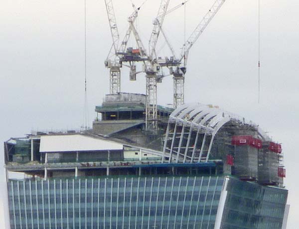 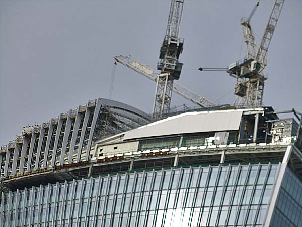 It should be pointed out that the journey from design to building was not straightforward. As Oliver Wainwright pointed out in an article in the Guardian on December 12, 2012, " First proposed in 2004, the design was criticised by both English Heritage and Unesco. The former declared it an "oppressive and overwhelming form" and a "brutally dominant expression of commercial floor space"; the latter threatened to add the Tower of London to the World Heritage in Danger list, because of the detrimental impact the skyscraper would have on its setting. It was bitterly contested by its neighbours over their right to light, and subjected to a public inquiry over heritage concerns. Yet, ever in thrall to the intoxicating cocktail of big business, star architects and a quirky nickname, the planners cheerfully beckoned the scheme through." Wainwright adds that Vinoly's reaction to the criticism was, " "As Oscar Niemeyer used to say, 'You can like it or dislike it, but you're not going to forget it.'" 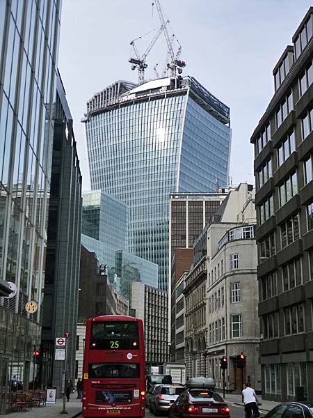 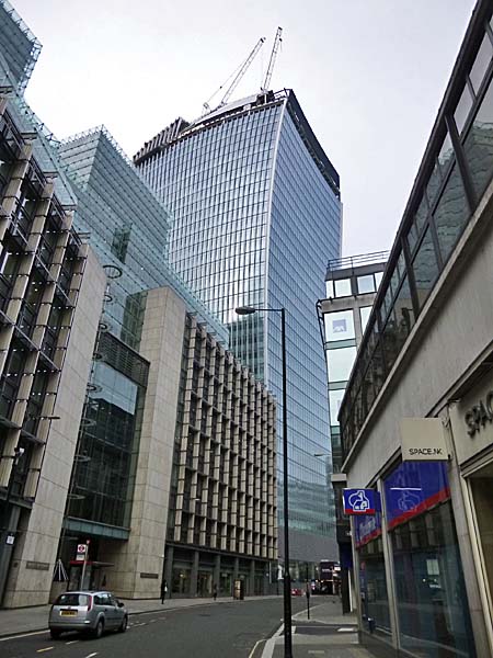 Another bump along
the road arose when it became apparent
that the curved southern aspect of the
building was acting like a lens and
focusing the suns rays on the streets
below. One person's complained
that the finish on his Jaguar car had
bubbled up and melt. A headline
in the Guardian in September of 2013
read, "Walkie Talkie developers
build screen to stop 'death ray' -
Shield is erected after shops in
City of London complain of burning
carpets and melted furniture."
The building became known as Walkie-
Scorchie. The solution to the
problem will be a permanent brise
soleil made of aluminium fins.
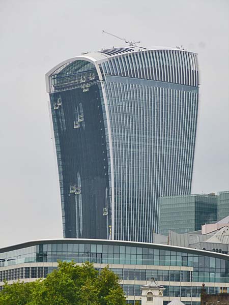
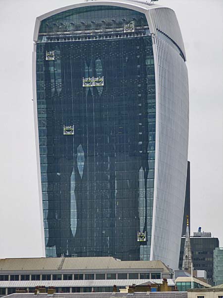
When I took the images below in
September of 2014, it appeared that as
a temporary measure the building was
being, or had been, swathed in
netting.
  |
|
20
Fenchurch Street - The Walkie-Talkie, London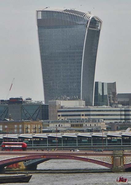 Image Above taken in October 2014 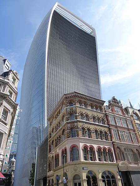 *************** Watching it grow .... August, 2013 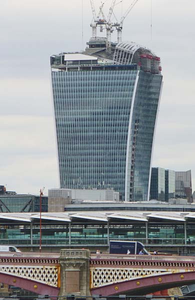 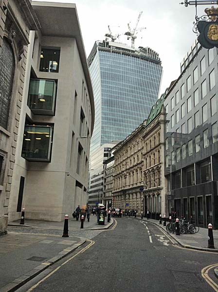 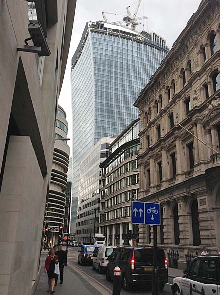 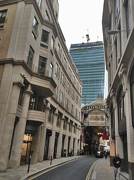  Image above taken on June 6, 2013 Below March 3, 2013 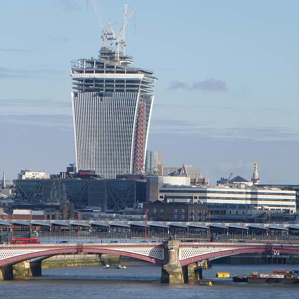 October 13, 2012 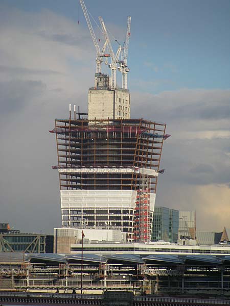 September 22, 2012 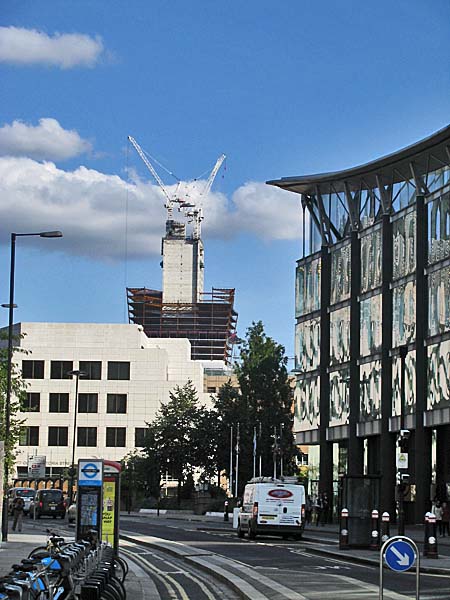 Close Window  |